Months ago. Literally. I hinted at a new kind of project I had taken on.
However, posting about said new project took months since the actual completion of the project took a little longer than anticipated.
I love home decorating and styling.
Love.
I am the girl that when given ‘fun’ money from our family budget will 9 out of 10 times spend it on our home. It’s my favorite. Even over clothes. (Although, tiny little pink things seem to be giving this habit a run for it’s money.)
So when a friend moved down to Florida last July and bought his first place, he offered me the job of decorating his house. I said ‘YES!’ of course and jumped at the opportunity. His only real request was that I design the home in such a way that created a cohesive and put together look; he wanted it to be comfortable but with style and purpose.
He purchased a beautiful home in a beautiful neighborhood and asked me to design the living spaces that included a living room, dining room as well as a library/study area, a guest bath, and his master suite.
I learned many things about myself during this process. The biggest thing I learned was that no matter how amazing the end product was (and it is rather amazing! too bad I don’t have before photos!) and how much I love this hobby, I cannot delve into interior design during this season of my life. I can relatively easy run my graphic design business and shop from home in my cute little office with little ones running around me. If I need to stop to play blocks or fix lunch or read a book or rock and sing lullabies that works without any real delay. But attempting day long shopping trips, hauling furniture up multiple flights of stairs, painting bathrooms, or even making little diy projects in an environment not my own is not conducive to a mommy of little ones. So, for now this hobby will stay just that, a hobby.
Over the next few days I will be showing you rooms from Nate’s home and will be adding a ‘Inside Real Homes’ decorating feature on this blog. I have a plethora of rooms to show you from our new house we just moved into in January. And I heard from a bird that a friend of mine who is an amazing decorator is moving in the next few months as well. I am positive she will give me plenty to post about! I am excited to incorporate my love for decorating in a way that still works for me at this time in my life.
Note: all photography, with the exception of one or two, is by my sweet friend Kortni of Kortni Marie Photography. She not only photographed the entire home for me when the makeover was over but was also my design assistant giving me that extra design insight (and set of hands!) when I really needed to get this project completed. Thank you Kortni!
So, without further ado, welcome to:
Nate’s House
{Living Room}
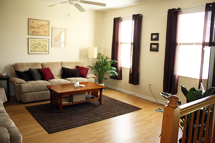
Working with a budget and his existing furniture the goal was to create a cohesive look. He went through a number of my decorating magazines marking his favorite rooms and every one of them were neutral, airy palettes. That look worked very well with his home that has perfect lighting all throughout the day making it a naturally airy space. We left the wall color as it fit nicely into that neutral palette and added pops of deep espresso and white.
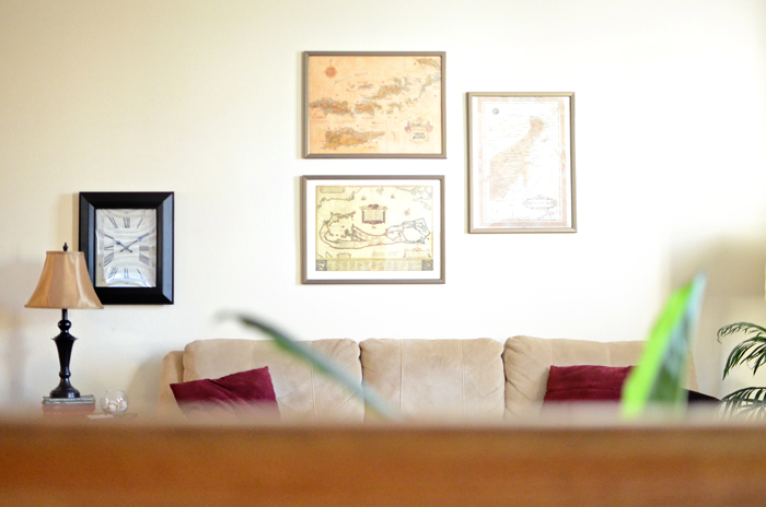
Nate has a love for old maps so I used a portion of his collection here in the living room above the sofa. Framing the maps and then hanging them as a collection was an inexpensive way to fill up such a large wall and give a focal point as soon as enter the living room.

Little details like large green plants (per his request!) and accent lamps add character. For the smaller lamps I stacked them on old books found at thrift stores to give height to the lamp as well as bring in more vintage details, which he was drawn to as well.
{Dining Room}
The living and dining room are an open concept so everything needed to work together. (This photo was taken before the dining room was made complete with a little diy project you will see below.) I found this table and chairs at an overstock, scratch & dent furniture warehouse. It was perfect for his home. It has great lines and the bulk adds to the masculine feel while the chairs still allow it to be comfortable and casual.
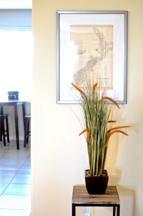
I scored the mirror (obsessed! and wish it were mine) from TJ Maxx. It looks like it’s made out of driftwood. So perfect for this space. Another antique map brings cohesion to this side of the room.

I needed a large focal point on this wall but it needed to work with the framed map collection above the couch. It took me some time to figure out exactly what I wanted to put here. In a perfect world with an endless budget I would have loved a buffet here. But a buffet for a single guy seems kind of like pointless spending. So, my next option was to create something massive to fill this space. I decided to do my very own stick artwork. A few of my friends have created art very similar to this and I thought it would be the perfect solution. It has this wonderful natural element that ties into the dining room chairs, the shape filled the empty space providing a great focal point, the color worked perfectly with the collection of maps in the living room and the nature of the art creates movement forcing your eye to move across the room ensuring there are no competing elements in the space. Just beautifully balanced pieces that work seamlessly together.
So, what do you think of Nate’s Living and Dining Room?
I plan to reveal his library/study and guest bathroom tomorrow!


